
Telling a story with data is one part finding the right words, and one part finding a compelling visual way to present numbers. Good visualization of data conveys the “big picture” at a glance. At the same time, it includes details so that the audience understands and sees both the whole and the parts. Effective charts also invite visual comparisons so that the viewer sees (without having to think about) the trends and patterns we are highlighting in a story.
We highly recommend learning about theories of presentation, perception, and data visualization, and we are big fans of Edward Tufte’s approach to visual explanations. At the same time, we recommend learning the basics of using simple tools, like pie charts, bar charts, line graphs, and so on. One good source for developing a mastery of the basics is a book called Graphing Statistics & Data: Creating Better Charts, from which we have learned a few tips about using bar charts:
- Use bar charts to show variables with distinct (non-continuous) values
- Bar charts are good at showing both proportion and quantity (unlike pie charts, which are good at showing proportions only)
- Adjust the chart settings so that the bars are wider than the gaps between the bars. They need to be wide enough to invite visual comparisons among them, but not so wide that they resemble a histogram (see the examples below)
- If your variable has many values you want to show, or if labeling the values requires a lot of text, use a horizontal bar chart
- For horizontal bar charts, rank order the bars so that long bars (high values) are at the top of the chart, and short bars (low values) are at the bottom

This bar chart is flawed because the bars are too skinny relative to the spaces between them. They do not invite visual comparison.
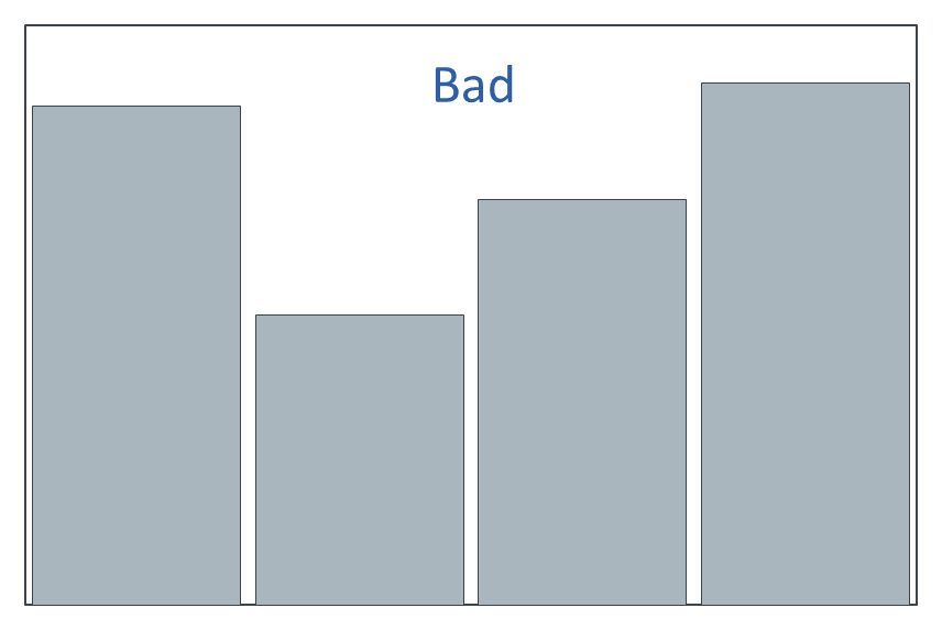
The bar chart is flawed because the spaces between the bars are too narrow. It makes the chart look like a histogram, which is appropriate only for continuous variables.
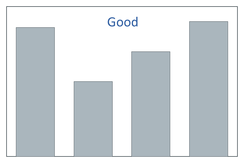
This bar chart is just right.
As most of us know from having tried to disentangle one too many indecipherable charts in murky research reports, these basics seem easy, but they rarely are. They require skill, art, and expertise developed through years of day-to-day efforts to understand, synthesize, and communicate data. When done well, good charts tell the story of the data.
—Joe Hopper, Ph.D.


